The Enya Learning Identity
30 November, 2025
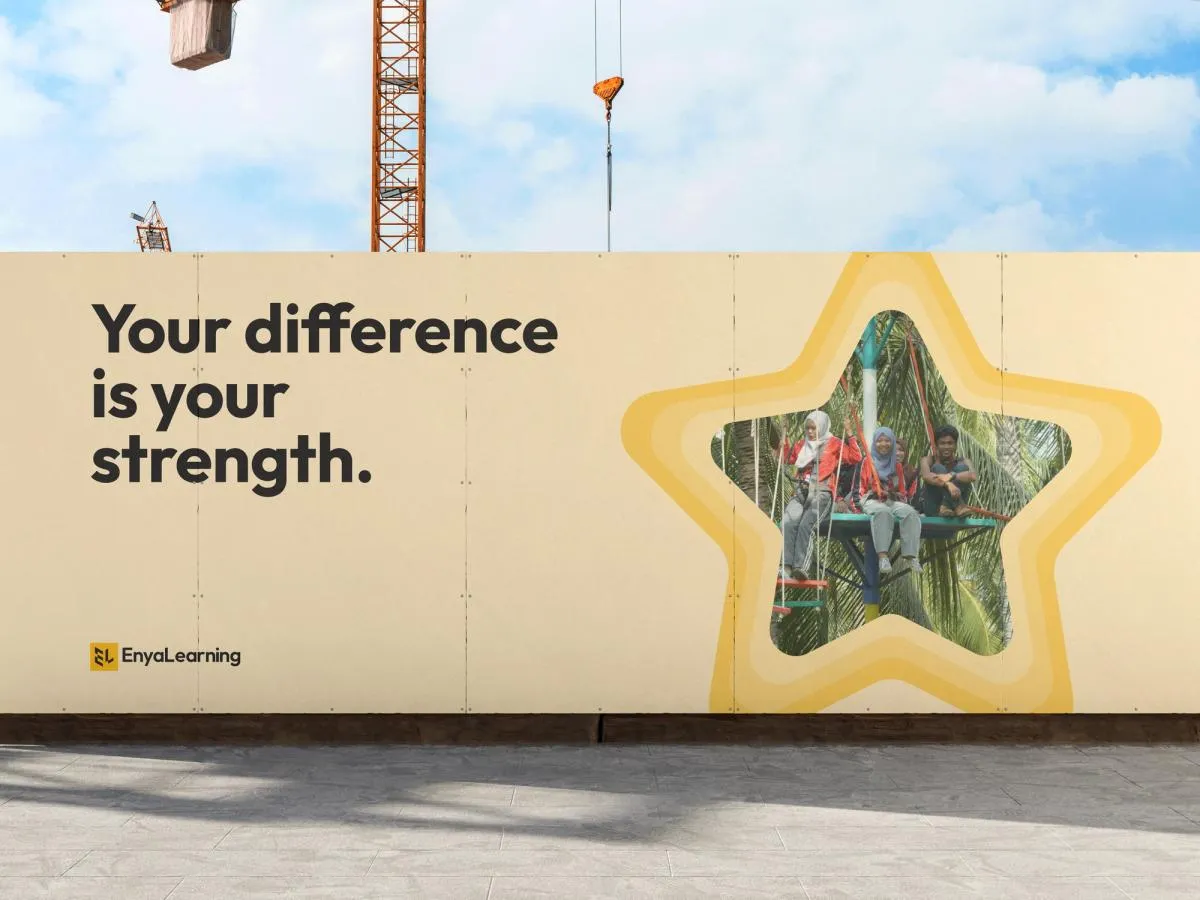
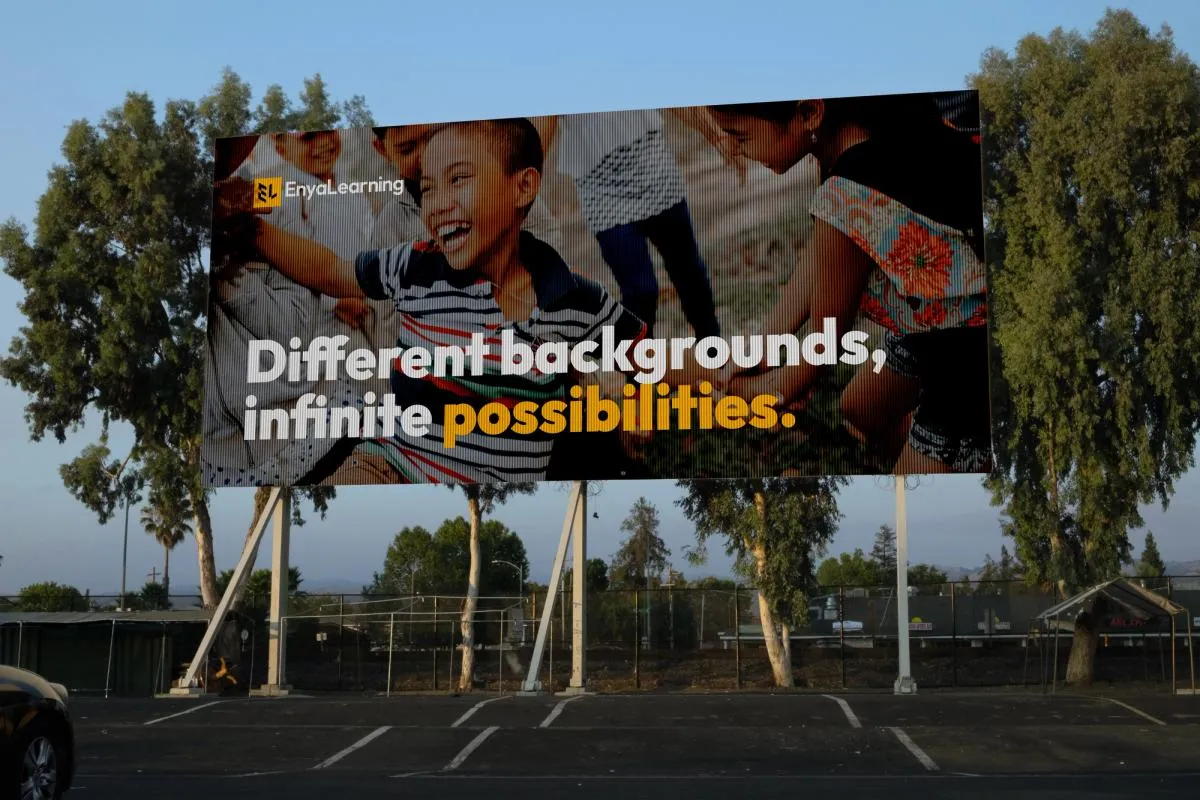
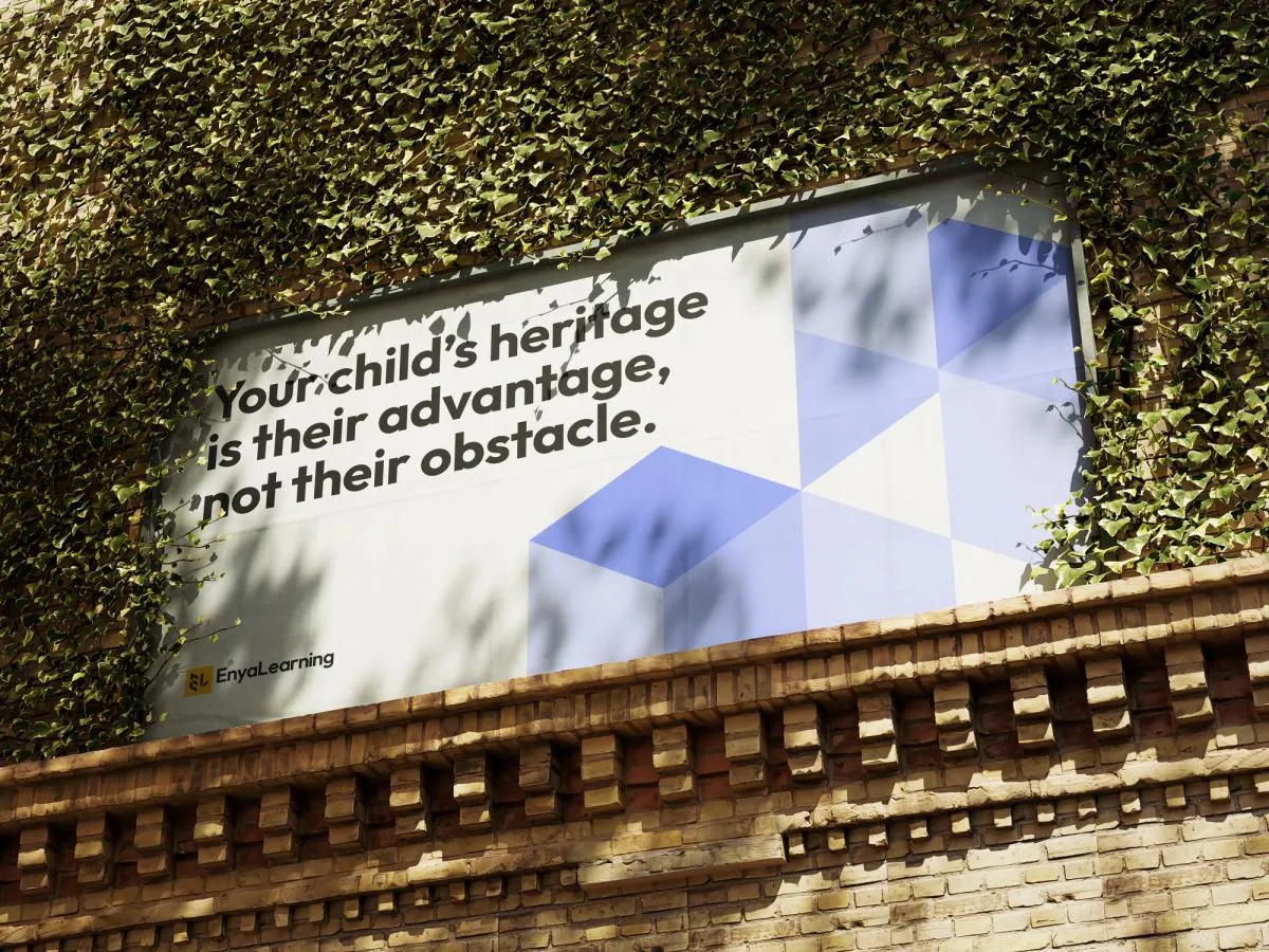
Enya Learning is an ed-tech non-profit dedicated to providing personalized education to immigrant and newcomer children ages 6-12.
When I joined Enya in January 2025, I noticed a disconnect between start-up’s vision of education and the brand’s visual identity. The previous identity helped the company get started in the education sector, but it didn’t capture the depth or emotional connection it needed. As the company embarked on its mission, it became clear that a new identity needed to grow alongside it.
Rethinking the brand

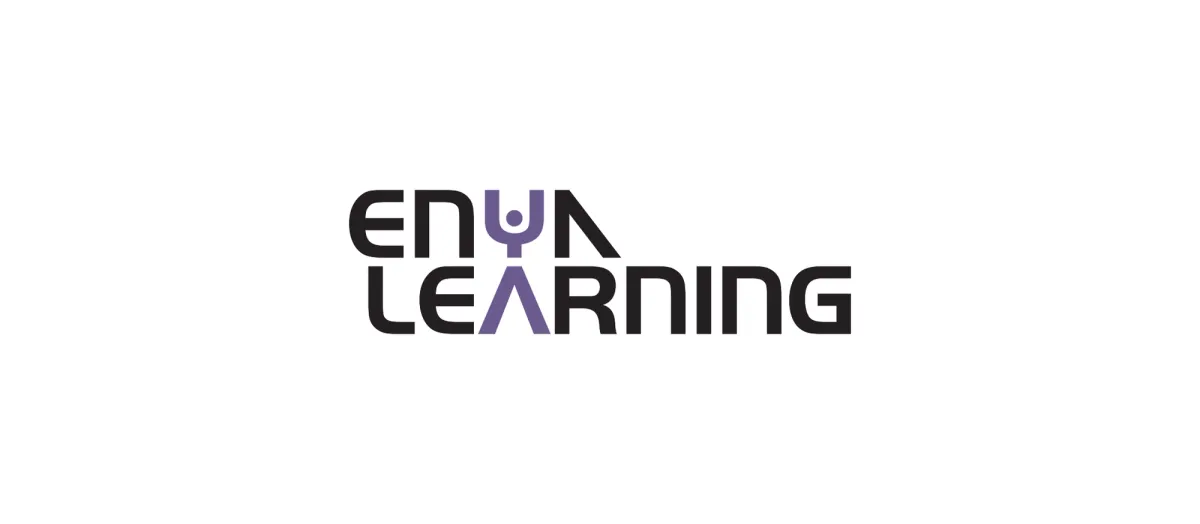
My job was rethinking the brand from the ground up from its logo to identity with help from the founding director. The new logo comes from an initial conversation with the team on how about how we think of Enya as bridging the gap for newcomer students in Canada. This stuck with me as I was sketching ideas. Gaps and Lego-style blocks were imminent in my sketches as learning often involves a combination of pieces of knowledge being put together.

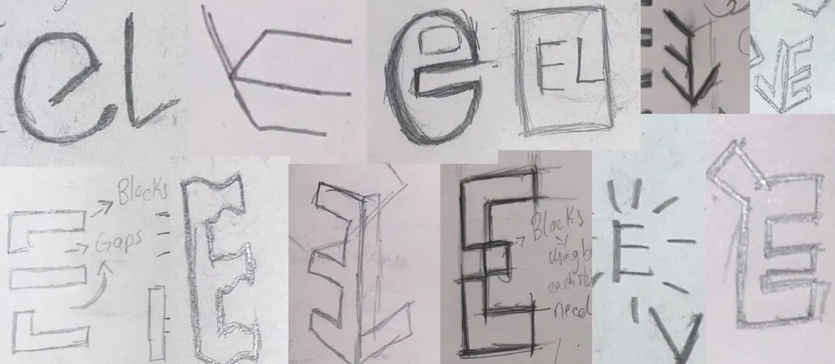
Once the team saw the vectorized sketches, we all agreed that the “gap” concept for the logo was the best. Then I proceeded to explore how the gaps on the logo mark look.

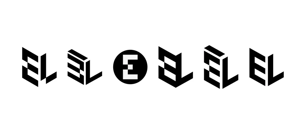
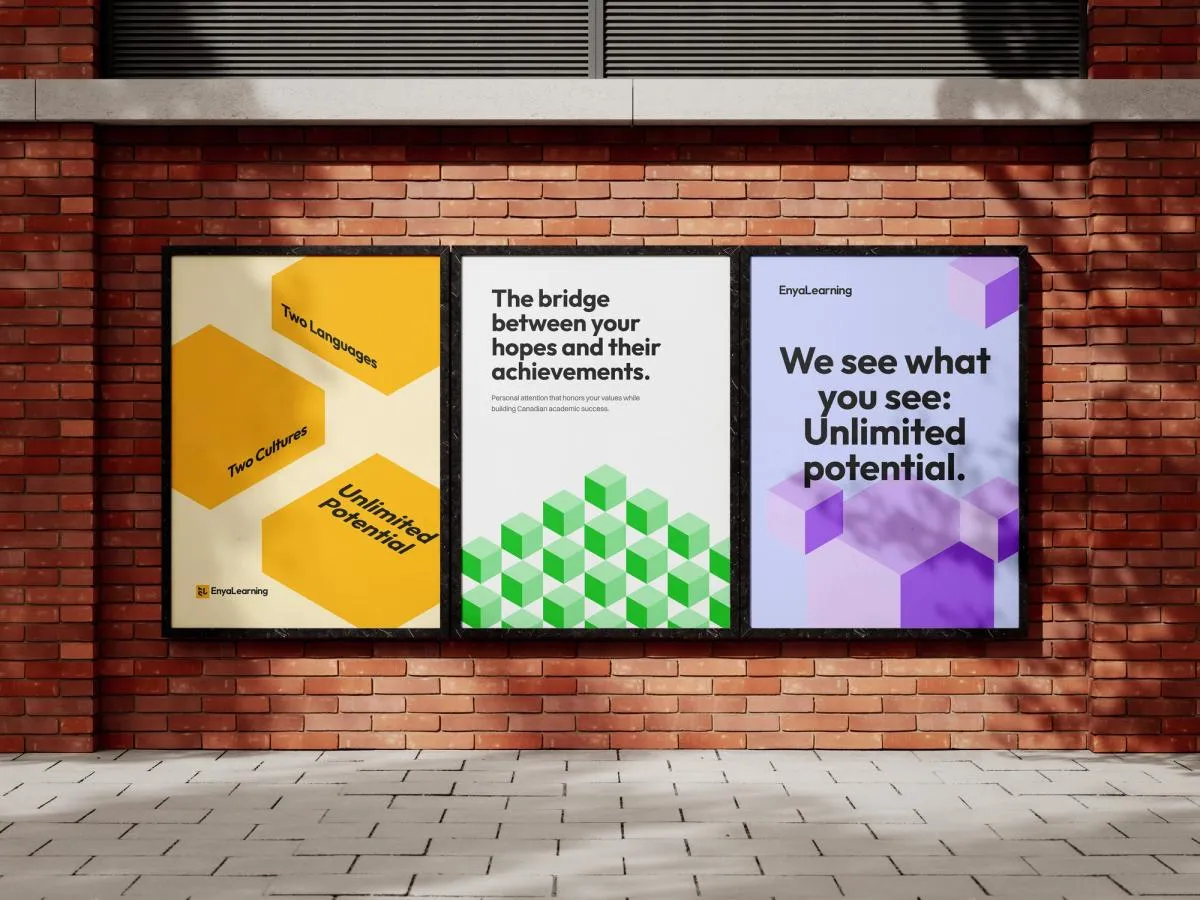
The final identity
We settled on using the “E” from Enya to represent everyone in our journey, students, parents, educators, team members. The “L” from learning to highlight our culturally inclusive approach to education. The intentional gaps symbolize the idea that while gaps exist, they’re meant to be overcome together.

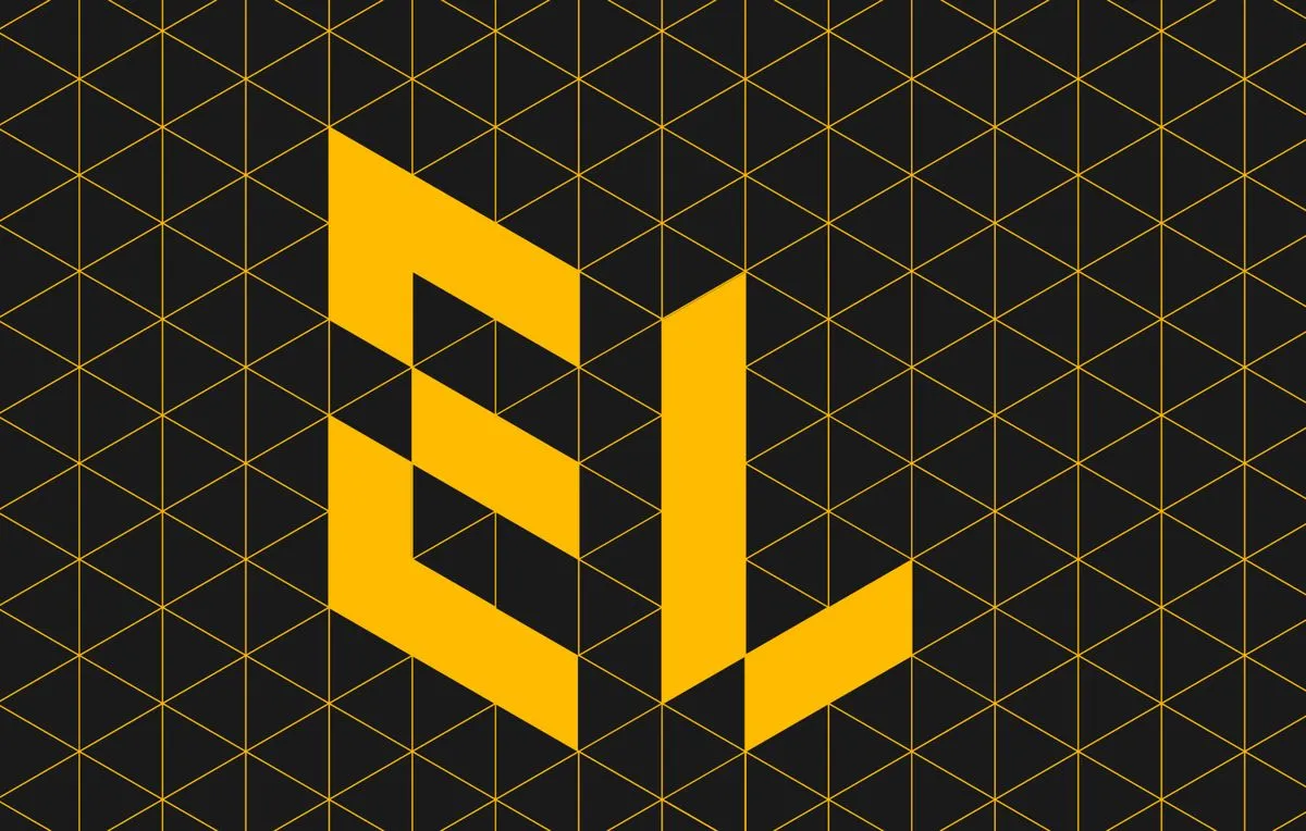
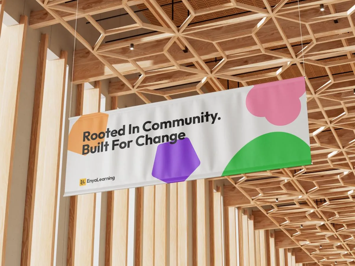
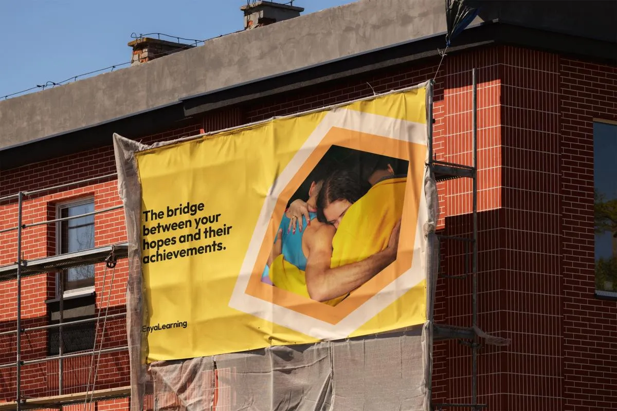
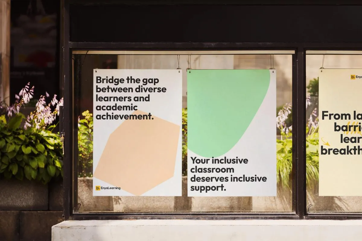
For colours, we wanted the colour palette to be warm and inviting. Yellow defines the brand essence to mimic the sun as we aspire to be a shining light to our audience, illuminating the path to knowledge and growth. We compliment yellow with black and white as the primary brand colours and support them with bold green, orange, blue, purple and pink accents to round out the colour palette.